Custom hats, shirts, and more – Order online today!

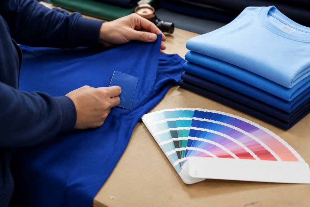
How to Ensure Accurate Color Matching for Custom Apparel
Master accurate color matching for custom apparel. Learn calibration, color spaces, and file prep to prevent mismatches. Get started today.
Table of Contents
- Why Color Matching Fails in Custom Apparel Production
- Understanding Screen Calibration and Color Accuracy
- RGB vs CMYK for Apparel Printing: Choosing the Right Color Space
- Pantone Color Matching Guide for Consistent Results
- Best Practices for File Preparation to Prevent Color Shifts
- How Lighting and Substrate Impact Color Perception
- Step-by-Step Process to Verify Accurate Color Matching Before Production
- Conclusion
Last Updated: August 23, 2026
Why Color Matching Fails in Custom Apparel Production
Color mismatches plague custom apparel manufacturers because color isn’t objective, it’s perceived. The same RGB file looks different on your monitor than on printed fabric. What appears correct under studio lights may look wrong under customer fluorescents. Substrate variation, ink formulation differences, and screen calibration drift create a perfect storm for color failure.
At Action Designs, we understand that preventing color shifts requires understanding where failures originate. Most production teams focus on the print itself, but real problems start during file preparation and calibration. You can have the best equipment available, but a broken color management workflow produces broken output.
The path to accurate color matching starts with one uncomfortable truth: you cannot trust what you see. Only by removing human visual assessment from critical decisions and replacing it with standardized, measurable color systems can you achieve consistency.
Understanding Screen Calibration and Color Accuracy
Monitor calibration is where color accuracy begins, and where most operations fail. An uncalibrated screen displays colors that don’t match your actual output.
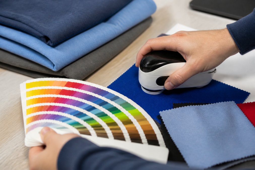
A spectrophotometer measures your monitor’s current color output and creates a profile that corrects its display. It removes opinion from the equation by reading exact color values and generating correction data.
Without calibration, your monitor drifts over time. Brightness fades. Color temperature shifts. You don’t notice because the change is gradual, but your color decisions compound the problem.
A proper calibration workflow: measure your monitor with a spectrophotometer, create an ICC profile specific to your display, load that profile into your design software, and set your viewing environment to 5000K lighting (daylight temperature) (iso.org). This removes the variable of ambient light influencing perception.
The ICC profile (International Color Consortium profile) is the technical foundation of color management. It tells your software how to translate color values from one device to another. When these profiles don’t communicate correctly, colors shift unpredictably.
Recalibrate your monitor every 2-4 weeks if you’re making critical color decisions daily. Environmental changes, seasonal lighting shifts, and equipment moves can degrade calibration.
RGB vs CMYK for Apparel Printing: Choosing the Right Color Space
RGB and CMYK are fundamentally different color models, and using the wrong one creates immediate problems.
RGB (Red, Green, Blue) is additive, you’re adding light together. Your monitor uses RGB and can display more colors than CMYK.
CMYK (Cyan, Magenta, Yellow, Black) is subtractive, you’re removing light by adding ink. It has a smaller color gamut than RGB.
Apparel printing methods vary in which color space they use. Screen printing traditionally works with spot colors or CMYK separations. Direct-to-garment (DTG) printing can work with either depending on equipment.
The critical mistake: designers create files in RGB, assuming the printer will convert to CMYK automatically. Conversion is imperfect. Colors shift during conversion because some RGB colors don’t have CMYK equivalents. A vibrant neon green might become dull olive when converted to CMYK.
The solution: design in the color space your final output uses. If you’re doing screen printing with CMYK separations, design in CMYK from the start. If you’re using DTG, confirm whether they want RGB or CMYK input, then design accordingly.
Pantone colors bridge this gap. They’re spot colors with standardized formulations. When you specify Pantone 286 Blue, you’re specifying a physical ink mixture, not an RGB or CMYK value. This removes the color space conversion problem entirely.
Pantone Color Matching Guide for Consistent Results
Pantone exists because RGB and CMYK don’t guarantee consistency across different print runs or vendors. A Pantone color is a standardized formula that produces the same result every time, on any substrate, with any printer using genuine Pantone inks.
The Pantone Matching System (PMS) assigns unique numbers to specific colors. Pantone 185 Red is always Pantone 185 Red when the printer uses legitimate Pantone inks mixed to specification. This standardization is why professional apparel operations specify Pantone colors instead of relying on RGB or CMYK values.
Providing Pantone references dramatically improves color accuracy. Instead of describing "a medium blue," you specify "Pantone 279 Blue." The printer knows exactly what to mix.
Pantone publishes color guides with actual ink samples printed on different substrates. The Pantone Fashion + Home Color Guide includes samples on cotton and apparel materials (pantone.com). This is crucial because the same Pantone ink looks different on cotton versus polyester versus nylon due to how each substrate absorbs and reflects light.
One limitation: Pantone colors exist within a defined gamut. Not every color has a Pantone equivalent. If your design requires a color outside the Pantone range, find the closest match or work with your printer to develop a custom formulation using spectrophotometer readings.
For multi-color designs, build your palette using Pantone colors and limit designs to 4-6 colors if possible. Each additional color increases complexity and multiplies opportunities for color drift.
Best Practices for File Preparation to Prevent Color Shifts
File preparation is where most color matching problems originate.
Start with the right file format. Adobe Illustrator or PDF files are standard for custom apparel work and preserve color information reliably. Avoid JPEG or PNG files for final artwork, these compress data and lose color precision.
Embed your ICC profile in the file if your software allows it. This tells the printer exactly what color space you’re working in. Not all printers read embedded profiles, but many do.
Convert all colors to the appropriate color space before sending files to production. If you’re doing CMYK work, convert to CMYK in your design software and verify visually. Mixed color spaces in a single file create confusion and errors.
Name your layers clearly if using spot colors. Instead of "Layer 1," use "Pantone 286 Blue." This removes ambiguity for the printer.
Include a color reference document with your file, a simple PDF showing each color labeled with its Pantone number or CMYK values. This takes five minutes and prevents most color matching disputes.
Test your file on multiple monitors if possible. If colors look dramatically different across displays, you have a file problem, not a printer problem.
How Lighting and Substrate Impact Color Perception
Color exists in a context of light and material. Change either variable, and the color changes in perception, which matters for customer satisfaction.
Lighting conditions are the most underestimated variable in color matching. The same apparel looks different under incandescent bulbs, fluorescent panels, LED lights, and natural daylight. Different light sources have different color temperatures and spectral distributions.
Daylight (around 5000K color temperature) is the standard reference in professional color work. Evaluate color matches under daylight or daylight-equivalent LED. If your customer will see apparel under office fluorescents, note that it will appear slightly different, but evaluate under standard daylight.
Substrate affects color dramatically. The same Pantone ink on white cotton looks different than on grey cotton. Cotton absorbs light differently than polyester. Thread color on embroidered apparel looks different than printed color because thread reflects light differently than ink.
A dark navy blue on black fabric becomes nearly invisible. A bright yellow on white fabric can look washed out. Your color choice must account for what it’s printed or embroidered on.
If matching colors across different substrate types, account for unavoidable variation. Communicate this to your client upfront.
Delta E quantifies color difference. A Delta E of 0-1 is imperceptible. A Delta E of 1-2 is barely noticeable. A Delta E of 3-5 is noticeable but often acceptable. Above 5 is clearly different (peer-reviewed research). Understanding Delta E helps determine whether a color shift is acceptable.
Step-by-Step Process to Verify Accurate Color Matching Before Production
This operational checklist prevents color disasters.
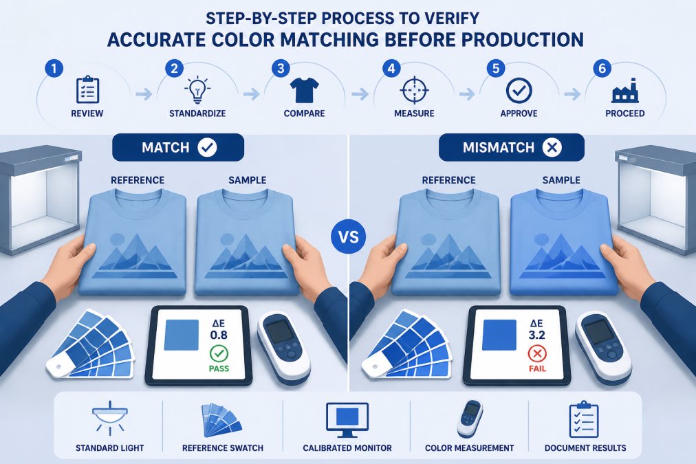
Step 1: Create a physical color reference. Print or produce a sample of your design on the actual fabric you’ll use for production. Physical samples are the only reliable reference.
Step 2: Measure the reference sample with a spectrophotometer. Take readings of each color. Record the Lab* values (standardized color measurement). These numbers become your production specification.
Step 3: Document lighting conditions. Note the light source and color temperature (ideally 5000K daylight). Use the same lighting when evaluating future production runs.
Step 4: Create a written color specification. Combine spectrophotometer readings, Pantone references, and substrate information into a single document. This becomes your production standard.
Step 5: Run a small test batch. Produce 5-10 units using your color specification. Evaluate under standardized lighting and compare to your reference sample. If Delta E is within tolerance, proceed to full production. If not, adjust and test again.
Step 6: Establish batch variation limits. Define acceptable color variation between units as a Delta E range. This prevents disputes about whether a color shift is acceptable.
Step 7: Verify production against specification on arrival. Measure samples from the production run and compare to your documented specification. Accept if within tolerance; request correction if outside.
Step 8: Archive your color specification. Store your reference sample, spectrophotometer readings, and documentation. If you reorder this design later, you have the exact specification.
This process takes time upfront but eliminates the most expensive part of color matching: production runs that fail and need redoing. A small test batch costs far less than discovering color problems after producing 500 units.
Accurate color matching isn’t magic, it’s process. When you remove guesswork and replace it with standardized measurement, documented specifications, and controlled lighting, color consistency becomes predictable and repeatable.
The apparel industry has standardized tools: spectrophotometers, ICC profiles, Pantone color systems, and Delta E measurement. These aren’t optional luxuries, they’re the foundation of professional color management. When working with a custom apparel vendor, confirm they’re using these tools.
Action Designs integrates spectrophotometer measurement, ICC color profiles, and documented color specifications into every custom order. This ensures that whether you’re ordering 10 shirts or 1,000, the color you see in samples is the color you receive in production.
Get a quote from Action Designs today and let’s ensure your next custom apparel order matches your vision exactly.
=== FAQ ANSWERS (audit these too, same rules) ===
[1] Q: Why do my printed colors look different than they do on my screen?
A: Your screen displays colors in RGB color space, while apparel printing uses CMYK or spot colors like Pantone. RGB has a wider color gamut, so vibrant screen colors often can’t reproduce exactly on fabric. Additionally, uncalibrated monitors, ambient lighting, and fabric texture all affect how color appears. Using an ICC profile specific to your printer and calibrating your monitor ensures what you see matches what prints.
[2] Q: What is the difference between RGB and CMYK color modes for apparel printing?
A: RGB (red, green, blue) is used for screens and creates color through light. CMYK (cyan, magenta, yellow, black) is used for printing and creates color through ink or dye on fabric. CMYK has a smaller color gamut than RGB, meaning some bright screen colors cannot be reproduced in print. Converting files to CMYK before production prevents unexpected color shifts and ensures your printer can accurately render the colors in your design.
[3] Q: What are Pantone Matching System (PMS) colors and how do they help with accuracy?
A: Pantone colors are standardized spot colors identified by specific numbers (like Pantone 186 for red). Using PMS colors eliminates guesswork because your printer can mix exact ink formulations to match the standard. This is especially valuable for brand logos and repeated orders, as the same Pantone number will produce consistent color across different batches and printing runs, regardless of CMYK conversion variables.
[4] Q: How does lighting affect how color looks on finished apparel?
A: Ambient lighting dramatically changes color perception. Fluorescent, incandescent, and natural daylight all render colors differently. Professional color evaluation uses standardized lighting conditions (typically 5000K daylight). When reviewing color samples, view them under the same lighting conditions where the apparel will be worn or displayed. This prevents surprises after production and ensures the color matches your expectations in real-world environments.
Frequently Asked Questions
Why do my printed colors look different than they do on my screen?
Your screen displays colors in RGB color space, while apparel printing uses CMYK or spot colors like Pantone. RGB has a wider color gamut, so vibrant screen colors often can't reproduce exactly on fabric. Additionally, uncalibrated monitors, ambient lighting, and fabric texture all affect how color appears. Using an ICC profile specific to your printer and calibrating your monitor ensures what you see matches what prints.
What is the difference between RGB and CMYK color modes for apparel printing?
RGB (red, green, blue) is used for screens and creates color through light. CMYK (cyan, magenta, yellow, black) is used for printing and creates color through ink or dye on fabric. CMYK has a smaller color gamut than RGB, meaning some bright screen colors cannot be reproduced in print. Converting files to CMYK before production prevents unexpected color shifts and ensures your printer can accurately render the colors in your design.
What are Pantone Matching System (PMS) colors and how do they help with accuracy?
Pantone colors are standardized spot colors identified by specific numbers (like Pantone 186 for red). Using PMS colors eliminates guesswork because your printer can mix exact ink formulations to match the standard. This is especially valuable for brand logos and repeated orders, as the same Pantone number will produce consistent color across different batches and printing runs, regardless of CMYK conversion variables.
How does lighting affect how color looks on finished apparel?
Ambient lighting dramatically changes color perception. Fluorescent, incandescent, and natural daylight all render colors differently. Professional color evaluation uses standardized lighting conditions (typically 5000K daylight). When reviewing color samples, view them under the same lighting conditions where the apparel will be worn or displayed. This prevents surprises after production and ensures the color matches your expectations in real-world environments.
This article was written using GrandRanker