Custom hats, shirts, and more – Order online today!

How to Prepare Artwork for Printing: A Complete Guide
Learn how to prepare artwork for printing with step-by-step instructions covering resolution, color modes, file formats, and proofing techniques. Get it.
Table of Contents
- Understanding Image Resolution and DPI for Print
- CMYK vs RGB for Printing: Choosing the Correct Color Mode
- How to Vectorize an Image for Print
- Setting Up Bleeds, Trim Marks, and Margins
- Preparing Artwork for DTF Printing
- Selecting File Formats and Proofing Your Design
- Common Print Errors and How to Avoid Them
- Conclusion
Last Updated: August 22, 2026
Understanding Image Resolution and DPI for Print
Resolution and DPI (dots per inch) determine whether your design prints crisp or blurry. DPI measures how many dots of ink the printer places per inch. For apparel printing, 300 DPI is the standard for professional results across screen printing and DTF (direct-to-film) printing (printing.org). This ensures fine details, logos, and small text remain sharp on the finished garment.
PPI (pixels per inch) is what you see on screen. A design at 72 PPI looks perfect on a monitor but appears jagged when printed, the most common mistake designers make. When preparing artwork for printing, work at 300 PPI minimum or resize appropriately before sending files to your printer.
The math is straightforward: if your final printed design is 4 inches wide, multiply 4 by 300 to get 1,200 pixels. A 1,200-pixel design at 300 PPI prints at exactly 4 inches with full detail. That same 1,200-pixel design at 72 PPI would print at 16.67 inches, enormous and blurry.
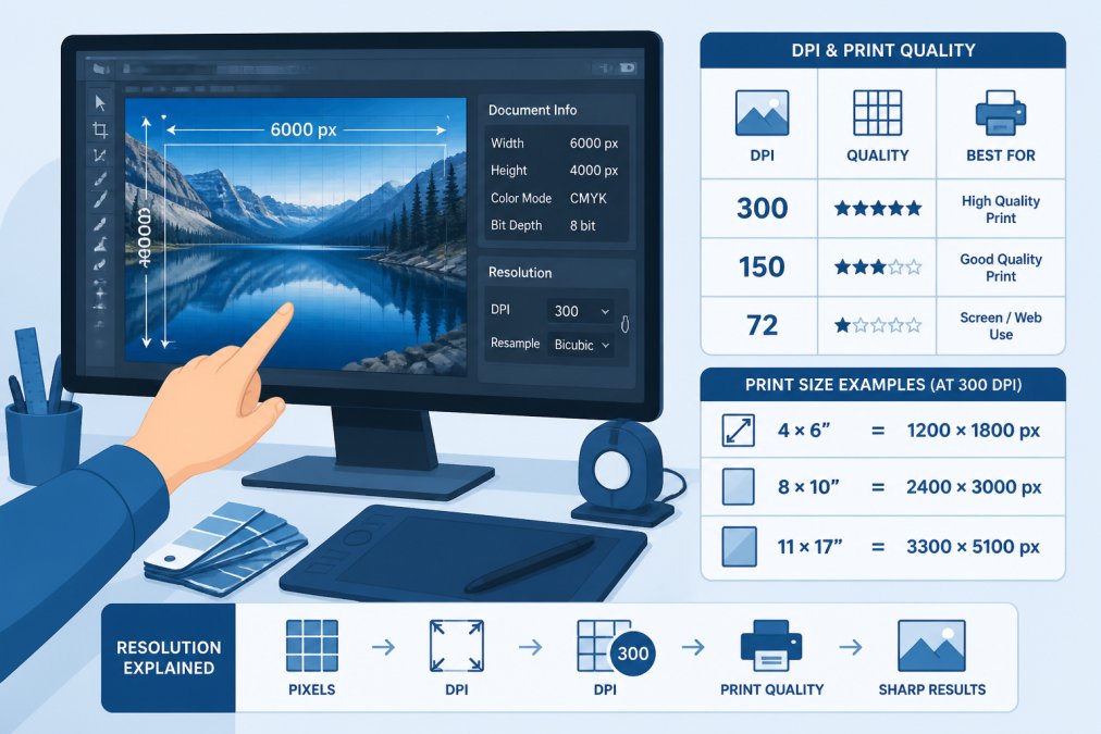
Check your file resolution before sending anything to print. Most design software shows this in image properties or document setup. If working with raster images, resizing down to 300 DPI is fine, but upscaling a low-resolution image adds no detail, it just makes pixels bigger. Start with the highest resolution source material available.
Pro Tip
If unsure about your image’s current resolution, open it in your design software and check image properties. For Photoshop, go to Image > Image Size. For Affinity Photo, check Document > Canvas Size. The number next to “resolution” or “DPI” tells you everything. If below 300, resize or find a higher-resolution version.
If unsure about your image’s current resolution, open it in your design software and check image properties. For Photoshop, go to Image > Image Size. For Affinity Photo, check Document > Canvas Size. The number next to “resolution” or “DPI” tells you everything. If below 300, resize or find a higher-resolution version.
CMYK vs RGB for Printing: Choosing the Correct Color Mode
Your monitor displays RGB (red, green, blue), light-based colors that look vibrant on screen. Printers use CMYK (cyan, magenta, yellow, black), pigment-based colors that reflect light off the garment. Skipping CMYK conversion causes colors to shift, reds darken, blues lose vibrancy, and bright greens turn muddy.
The color gamut differs significantly between systems. RGB can display colors that CMYK cannot reproduce on fabric (iso.org). Design in RGB, then convert to CMYK before sending files to your printer. Most professional printers require CMYK files; if you submit RGB, they’ll convert automatically, but results may not match your expectations.
When converting RGB to CMYK, bright, saturated colors shift most. Use soft proofing to preview how your design will look in CMYK before printing. In Photoshop, go to View > Proof Setup > Working CMYK. In Affinity Photo, use View > Proof. This shows exactly what the printer will produce.
If a color shifts too far, adjust the RGB values before converting again, or choose a more CMYK-friendly color. Avoid pure, bright RGB colors like pure red (255, 0, 0) or pure blue (0, 0, 255). Use slightly desaturated versions instead.
Key Takeaway
Always design in RGB, preview in CMYK using soft proofing, then convert to CMYK before submitting to your printer. This three-step process prevents color surprises and ensures your printed design matches your vision.
Always design in RGB, preview in CMYK using soft proofing, then convert to CMYK before submitting to your printer. This three-step process prevents color surprises and ensures your printed design matches your vision.
Action Designs works with both color modes and can guide you through the conversion process. Proper color mode management is essential to maintaining brand consistency across your apparel.
How to Vectorize an Image for Print
Raster images (JPEGs, PNGs, photographs) are made of pixels. When enlarged, pixels become visible and the image looks blocky. Vector images are made of mathematical paths and curves. You can scale them infinitely without losing quality. For print, vectors are superior because they remain sharp at any size.
If your logo exists only as a raster image, vectorize it by converting pixels into vector paths. Adobe Illustrator has an "Image Trace" feature: select your image, then go to Object > Image Trace > Make. Affinity Designer offers Photo > Vectorize. Inkscape provides Path > Trace Bitmap.
The quality of vectorization depends on the source image. A clean, high-contrast logo traces beautifully. A photo with subtle gradients traces into a complex file that may not look right. For photographs, keep them as raster images at 300 DPI instead.
After vectorization, check the result carefully. The traced vector should match the original closely. If colors shifted or details were lost, adjust trace settings and try again.
Watch Out
Vectorizing a low-resolution, blurry image won’t improve its quality. Tracing creates clean paths, but those paths follow the blurry original. Always start with the highest-quality raster source available. If your logo is a fuzzy screenshot, ask for the original file.
Vectorizing a low-resolution, blurry image won’t improve its quality. Tracing creates clean paths, but those paths follow the blurry original. Always start with the highest-quality raster source available. If your logo is a fuzzy screenshot, ask for the original file.
Setting Up Bleeds, Trim Marks, and Margins
Bleeds, trim marks, and margins ensure your design prints correctly. Without them, your final product may have white edges where you expected color, or important content may get cut off.
A bleed is the area extending beyond the final trim line. When a printer cuts your garment, the blade can shift slightly. A bleed of 0.125 inches (8 points) beyond the trim line ensures that if the cut shifts, color still reaches the edge (printing.org). Any design element you want edge-to-edge must extend into the bleed area.
Trim marks (crop marks) show the printer where to cut. They’re thin lines placed at corners and edges, 0.125 inches outside the final trim line. Margins are the safe area for important content, leave at least 0.25 inches from the trim line. Text, logos, and critical elements should stay within this safe zone.
Set up bleeds and margins before designing. In Photoshop, go to Image > Canvas Size and add space for bleeds. In Illustrator, go to File > Document Setup. In Affinity, use Document > Canvas Size. Most print shops provide templates with bleeds and margins already built in.
When exporting your final file, ensure bleeds and trim marks are included. In Photoshop, flatten and save as TIFF or PDF with bleeds embedded. In Illustrator, go to File > Export, choose PDF, and check "Include Bleeds." Confirm with your printer whether they need bleeds in the file or as separate marks.
Preparing Artwork for DTF Printing
DTF (direct-to-film) printing transfers ink from film directly onto fabric. Because film handles fine detail, DTF supports complex artwork with many colors and gradients. Preparation requirements differ from traditional screen printing.
Start with a 300 DPI image in CMYK color mode. If your design has gradients, fine lines, or photographic elements, DTF captures these details cleanly.
Color accuracy is critical. Request a color proof from your printer before full production. DTF inks vary slightly depending on equipment and formulation. A proof shows exactly what the final print will look like.
DTF requires a white underbase for dark fabrics. If printing a full-color design on a black shirt, the printer applies a white layer first, then prints your colors on top. This ensures colors appear vibrant instead of being absorbed into the dark fabric. Discuss white underbase options with your printer.
Most DTF printers accept PDF, TIFF, or high-quality JPEGs. PDF is often preferred because it preserves color profiles and resolution. When exporting to PDF, ensure the color space is CMYK and resolution is 300 DPI. In Illustrator, go to File > Export as PDF, then in the Output tab, select "CMYK" under Color Conversion.
Action Designs specializes in DTF printing and reviews files before production to catch issues that might affect the final result. If your artwork needs adjustments for optimal DTF output, we’ll let you know before printing begins.
Selecting File Formats and Proofing Your Design
The file format you choose affects how your printer receives and interprets your design. PDF is the gold standard for print files. It preserves color profiles, fonts, bleeds, and trim marks without alteration. Go to File > Export as PDF, then check "Preserve Illustrator Editing Capabilities" if you want to edit later. For color, choose "Convert to Destination (Preserve Numbers)" to maintain your CMYK values.
TIFF is excellent for raster images. It supports high resolution, multiple color modes, and layers. For artwork with photos or complex gradients, TIFF works well. Save with LZW compression (lossless) to keep file size reasonable.
JPEG is acceptable for photographs but not ideal for logos or solid-color designs. JPEG uses lossy compression, which discards data and can create artifacts around sharp edges and text. If using JPEG, choose the highest quality setting (90% or higher).
Avoid submitting native software formats like PSD or AI unless your printer specifically requests them. Convert to PDF or TIFF instead.
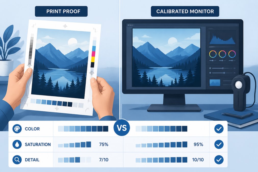
Proofing is your final quality check before production. Request a digital proof or physical sample. A digital proof is a high-resolution image of what the print will look like. A physical proof is an actual printed sample on your garment or material. Physical proofs cost more but show exactly what you’re getting.
When reviewing a proof, check color accuracy, sharpness of details, and proper placement. If something is off, request adjustments before full production.
Pro Tip
Always request a proof, even if it costs extra. The cost is negligible compared to reprinting an entire order because colors didn’t match or the design was positioned wrong. Proofing is insurance that your final product meets your standards.
Always request a proof, even if it costs extra. The cost is negligible compared to reprinting an entire order because colors didn’t match or the design was positioned wrong. Proofing is insurance that your final product meets your standards.
Common Print Errors and How to Avoid Them
Incorrect color mode is the most frequent problem. Submitting RGB files when CMYK is required results in unexpected color shifts. Convert to CMYK and soft-proof before sending anything.
Low resolution creates blurry, pixelated output. Always work at 300 PPI for print. If you inherit a low-resolution image, ask for a higher-resolution version rather than upscaling.
Missing bleeds and trim marks cause edge problems. Extend color into the bleed area if it should go edge-to-edge. Without trim marks, the printer guesses where to cut, resulting in inconsistent sizing.
Fonts that don’t embed cause text to render incorrectly. Outline your fonts (convert text to paths) so the printer doesn’t need the original font file. In Illustrator, select all text and go to Type > Create Outlines. In Affinity, select text and go to Type > Convert to Curves.
Improper color profiles lead to color mismatches. Embed the correct color profile in your file. For CMYK files, embed the printer’s recommended profile if provided.
Excessive file size causes printing delays or errors. Optimize by flattening unnecessary layers, compressing images, and removing unnecessary elements. Files should rarely exceed 500 MB.
Transparency and effects behave unexpectedly in print. Flatten your design to remove transparency before exporting. Drop shadows and glows may print differently than they appear on screen. Test with a proof.
When you work with Action Designs, our team checks files before production. If we spot an issue, we’ll contact you to fix it before printing begins.
Preparing artwork for printing requires attention to resolution, color mode, file format, and structural elements like bleeds and margins. The difference between professional results and disappointment often comes down to these technical details. Start with 300 DPI, convert to CMYK, include bleeds and trim marks, and always request a proof before full production.
Action Designs handles the technical requirements so you can focus on your design vision. Our team reviews every file, manages color accuracy, and ensures your artwork translates perfectly to the finished garment. Get a quote to get started with DTF, screen printing, embroidery, or any of our other printing techniques.
Frequently Asked Questions
What resolution should my artwork be for high-quality printing?
For apparel printing, use a minimum of 300 DPI (dots per inch) at final print size. Screen printing and DTF printing both require this resolution to avoid pixelation and ensure crisp details. If your design will be printed at 12 inches wide, your file should be 3,600 pixels wide at 300 DPI. Lower resolutions like 72 DPI work for screen displays but will appear blurry and jagged when printed.
What is the difference between RGB and CMYK for printing?
RGB (red, green, blue) is used for screens and emits light, while CMYK (cyan, magenta, yellow, black) is the standard for printing and uses ink pigments. Your artwork must be converted to CMYK before printing to ensure accurate color reproduction. RGB files may print with unexpected color shifts because the color gamut differs between the two modes. Always convert to CMYK in your design software before submitting files for production.
How do I prepare my artwork for screen printing versus DTF printing?
Screen printing works best with bold, solid colors and simpler designs due to the nature of the process, while DTF (direct-to-film) printing handles complex, multi-color designs with fine details and photographic images. For screen printing, separate your design into individual color layers and use a TIFF or PDF file. For DTF printing, submit high-resolution artwork (300 DPI minimum) as a PNG or TIFF with transparency where needed. Both require CMYK color mode and proper bleed setup.
Why does my printed artwork look different than on my screen?
Color profiles and color gamut differences cause this mismatch. Screens display colors using RGB light, which has a wider gamut than CMYK ink. Your monitor may also be uncalibrated, showing inaccurate colors. Use soft proofing in your design software to simulate how colors will appear in print, and always request a physical proof before final production. This lets you approve the actual color output and make adjustments if needed.
This article was written using GrandRanker